
Fresh Kut’Em
Logo Design & Brand Identity Design
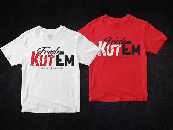
Objective: Create a bold and stylish brand identity for Fresh Kut ‘Em, a respected Twin Cities barber known for delivering top-tier haircuts with precision and personality.
Approach: The design uses dynamic typography and striking red and black tones to reflect the sharp, confident feel of a fresh cut. The word “KUT” is sliced diagonally, representing the edge and skill of each haircut, while the script “Fresh” adds a smooth, elevated touch. The scissors in the tagline tie it all together, keeping the focus on expert grooming.
Results: The final logo captures the energy and flair of the Fresh Kut ‘Em experience—clean, sharp, and memorable. It sets the tone for a modern barber brand that clients recognize and trust, perfectly blending professionalism with street-smart style.


